The happiest office in town

Designers Tal Gal and Liat Kedem bring color to an insurance office for extreme sports, owned by a cyclist, creating a vibrant and dynamic workspace.
Design: Tola Studio
Interior designers: Tal Gal and Liat Kedem
Photographer: Maor Moyal
"As someone whose color is their hallmark," explain the interior designers from Tola Studio, Tal Gal and Liat Kedem, "we expressed it in a slightly different way." Where was this path marked? In an insurance agency that specializes in extreme sports, one of whose owners is a professional cyclist.
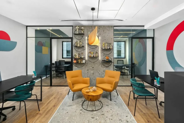
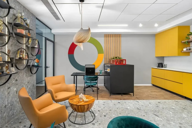
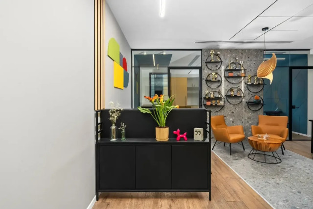
The 75 square meter office is located in Ness Ziona on the Science Campus. The client received the office as a shell, completely empty. The designers of "Studio Tola" chose first and foremost to divide the office into zones: two personal offices for each of the partners, and a central space with workstations, a sitting area and a kitchen The client wanted to emphasize the rounded logo of the company, so the designers made an artistic interpretation of it and created a logo, which is a colorful design element hanging on the wall. These two correspond to each other.
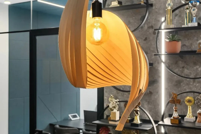
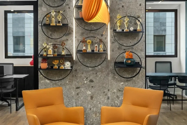
The client's love for the bicycle world as mentioned is reflected in the design of the space as well as the trophies he has won over the years. These are displayed in the public space using shelves that remind in a sophisticated way of bicycle wheels. The floor of the office is covered with warm and pleasant parquet, while in the center of the space a bicycle track was designed, which was designed using 1.80 m wide ceramic tiles that climb the wall, with a strip of lighting on both sides and the trophies are proudly placed in the center.
The very positioning of the shelves is deceptive and gives the impression that they are on the track. "The goal was to give a luxurious look and at the same time be accessible to visitors," the designers explain. On the track there is a waiting area with two camel colored armchairs and a wooden table in the middle.
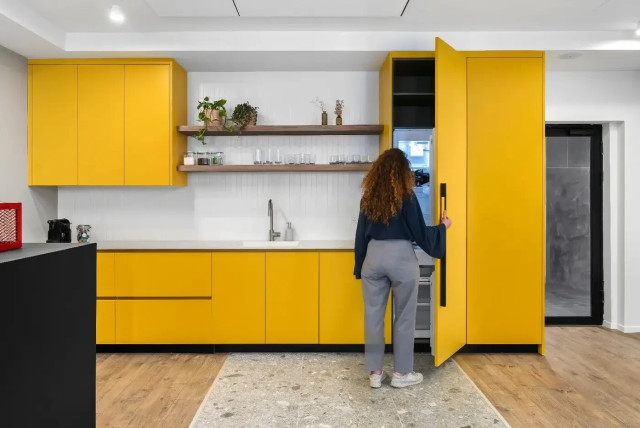
The kitchen in a yellow shade is also a derivative of the logo, with white coverings, whose role is to create a design separation and provide silence in the space. The design warmth entered by laser cuts of wooden beams on both sides of the office, which gave balance in the space and bounded the work stations.
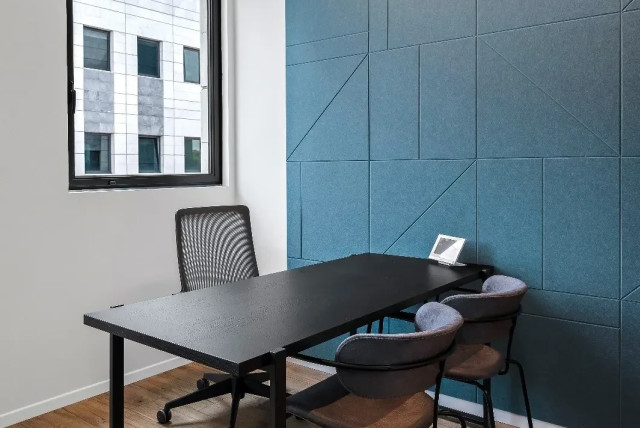
The private offices of each of the agents were designed with acoustic covering of the walls using acoustic tiles that climb on each wall and form the letter "R". The tiles are cut geometrically, in a blue shade, corresponding with the colors of the brand.
Jerusalem Post Store
`; document.getElementById("linkPremium").innerHTML = cont; var divWithLink = document.getElementById("premium-link"); if (divWithLink !== null && divWithLink !== 'undefined') { divWithLink.style.border = "solid 1px #cb0f3e"; divWithLink.style.textAlign = "center"; divWithLink.style.marginBottom = "15px"; divWithLink.style.marginTop = "15px"; divWithLink.style.width = "100%"; divWithLink.style.backgroundColor = "#122952"; divWithLink.style.color = "#ffffff"; divWithLink.style.lineHeight = "1.5"; } } (function (v, i) { });

